Firmware
Thoughts on Tesla’s 8.0 Navigation System

Tesla firmware 8.0 has been out for several weeks now but I wanted to hold off on a review -in specific, a review on the updated Navigation feature – until I had completed several trips using it. And now with several hundred miles logged using Tesla Navigation, I’ll offer up my opinion of it.
The summary is that, while noft quite as bad as the new Media Player, there are some glaring bugs in the basic functionality of 8.0 Navigation that get in the way of otherwise great improvements.
The Good
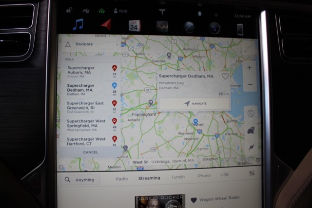
While controversial, the expanded map view (thanks to the auto-hiding menu bar) is a welcome addition that maximizes the use of the beautiful 17″ touchscreen.
Some owners have complained that it requires an extra press to get to other functions (charts, browser, phone app, etc) now, but for my daily use, I rarely change out of the two selected features displayed on my 17″ screen (Navigation and Media).
Another thing I really like is that Tesla preserved the current location information (street, city, state) while hiding the menu bar. It would have been a big loss if they had taken the easy path and removed it with the rest.
Another controversial change is Tesla’s decision to pin the Navigation screen to the top of the 17″ display by default. In the past, picking a new app put it on top by default, but now if Navigation is being shown, then picking another app will place it below the Navigation window. Some people, like myself, appreciate this new behavior, but others are frustrated by it and would like the old behavior back. A simple option in the user preferences would solve this but I also understand the drawbacks with adding too many options to an user interface.
Tesla has 4 view modes for the map:
- North up
- Heading up
- Trip overview
- Leg overview
Tesla added a new improvement to the map by displaying an indicator to the side of the road your destination resides on. Another nice feature is a new shortcut menu that helps you locate the closest chargers for your current location. While similar to the functionality provided by EVTripping’s Chargers page, although in a more graphical form, it still lacks the ability to bring up charger amenities and details with a quick tap.
Full disclosure: I’m the creator of EVtripping.com but would love to see Tesla incorporate some of our app features into its software.
The Bad
 When you plan a long road trip involving Superchargers, Tesla provides a comprehensive trip overview showing all stops and charge times that are needed for each location.
This is a great overview of your trip which highlights the number of required charges. What is different in this version is that after you start driving there doesn’t appear to be a way to get back to this trip overview. That’s a loss they should fix.
The way the system reports on round trip remaining charge still has me confused. I was trained to tap the bottom of the directions and quickly get my round trip range. Now I find myself awkwardly scrolling to the bottom of a list while driving to find it. And that’s if I’ve turned it on. Any list that requires scrolling used while driving should be eliminated as it can be a major distraction.
The Ugly
The Navigation system seems much slower to update now. Recently, while cruising in Boston, I literally had to stop at a light, after taking a wrong turn, just to wait for the map to update. Having done similar drives before and knowing the speed of map refresh, I believe performance has degraded which causes the basic Navigation functionality to be less useful.
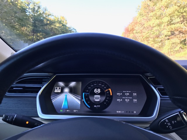
The worst and most glaring issue, in my opinion, involves the maps inability to properly discern tunnels. The system gets confused by tunnels and will show that you’re within one when in fact you’re not. It has been so bad that at times I’ve had to reboot the dashboard display.
8.0 Navigation Summary
Like the media player updates, I believe the improvements are a good step forward in many areas in terms of the user experience. The issues that I’ve run into need to be addressed in an upcoming patch or the 8.1 release.
Tesla’s Navigation system still lacks many of the features that other car manufacturers have had for almost a decade. Waypoints, alternative routes, route preferences, etc. Even some small usability issues, like the random sorting of favorites in the Navigation system, have not yet been addressed.
While I appreciate the upgraded user interface design, I can’t help but wonder about how Tesla determines the priority list for firmware feature updates. Are they focusing on features that target everyday driving or are they prioritizing feature sets based on user demand?

Firmware
Tesla mobile app shows signs of upcoming FSD subscriptions
It appears that Tesla may be preparing to roll out some subscription-based services soon. Based on the observations of a Wales-based Model 3 owner who performed some reverse-engineering on the Tesla mobile app, it seems that the electric car maker has added a new “Subscribe” option beside the “Buy” option within the “Upgrades” tab, at least behind the scenes.
A screenshot of the new option was posted in the r/TeslaMotors subreddit, and while the Tesla owner in question, u/Callump01, admitted that the screenshot looks like something that could be easily fabricated, he did submit proof of his reverse-engineering to the community’s moderators. The moderators of the r/TeslaMotors subreddit confirmed the legitimacy of the Model 3 owner’s work, further suggesting that subscription options may indeed be coming to Tesla owners soon.
Did some reverse engineering on the app and Tesla looks to be preparing for subscriptions? from r/teslamotors
Tesla’s Full Self-Driving suite has been heavily speculated to be offered as a subscription option, similar to the company’s Premium Connectivity feature. And back in April, noted Tesla hacker @greentheonly stated that the company’s vehicles already had the source codes for a pay-as-you-go subscription model. The Tesla hacker suggested then that Tesla would likely release such a feature by the end of the year — something that Elon Musk also suggested in the first-quarter earnings call. “I think we will offer Full Self-Driving as a subscription service, but it will be probably towards the end of this year,” Musk stated.
While the signs for an upcoming FSD subscription option seem to be getting more and more prominent as the year approaches its final quarter, the details for such a feature are still quite slim. Pricing for FSD subscriptions, for example, have not been teased by Elon Musk yet, though he has stated on Twitter that purchasing the suite upfront would be more worth it in the long term. References to the feature in the vehicles’ source code, and now in the Tesla mobile app, also listed no references to pricing.
The idea of FSD subscriptions could prove quite popular among electric car owners, especially since it would allow budget-conscious customers to make the most out of the company’s driver-assist and self-driving systems without committing to the features’ full price. The current price of the Full Self-Driving suite is no joke, after all, being listed at $8,000 on top of a vehicle’s cost. By offering subscriptions to features like Navigate on Autopilot with automatic lane changes, owners could gain access to advanced functions only as they are needed.
Elon Musk, for his part, has explained that ultimately, he still believes that purchasing the Full Self-Driving suite outright provides the most value to customers, as it is an investment that would pay off in the future. “I should say, it will still make sense to buy FSD as an option as in our view, buying FSD is an investment in the future. And we are confident that it is an investment that will pay off to the consumer – to the benefit of the consumer.” Musk said.
Firmware
Tesla rolls out speed limit sign recognition and green traffic light alert in new update
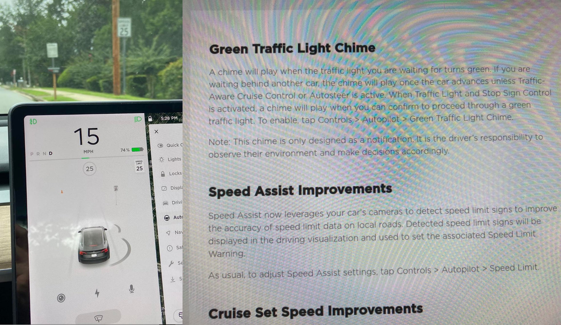
Tesla has started rolling out update 2020.36 this weekend, introducing a couple of notable new features for its vehicles. While there are only a few handful of vehicles that have reportedly received the update so far, 2020.36 makes it evident that the electric car maker has made some strides in its efforts to refine its driver-assist systems for inner-city driving.
Tesla is currently hard at work developing key features for its Full Self-Driving suite, which should allow vehicles to navigate through inner-city streets without driver input. Tesla’s FSD suite is still a work in progress, though the company has released the initial iterations of key features such Traffic Light and Stop Sign Control, which was introduced last April. Similar to the first release of Navigate on Autopilot, however, the capabilities of Traffic Light and Stop Sign Control were pretty basic during their initial rollout.
2020.36 Showing Speed Limit Signs in Visualization from r/teslamotors
With the release of update 2020.36, Tesla has rolled out some improvements that should allow its vehicles to handle traffic lights better. What’s more, the update also includes a particularly useful feature that enables better recognition of speed limit signs, which should make Autopilot’s speed adjustments better during use. Following are the Release Notes for these two new features.
Green Traffic Light Chime
“A chime will play when the traffic light you are waiting for turns green. If you are waiting behind another car, the chime will play once the car advances unless Traffic-Aware Cruise Control or Autosteer is active. When Traffic Light and Stop Sign Control is activated, a chime will play when you can confirm to proceed through a green traffic light. To enable, tap Controls > Autopilot > Green Traffic Light Chime.
“Note: This chime is only designed as a notification. It is the driver’s responsibility to observe their environment and make decisions accordingly.”
Speed Assist Improvements
“Speed Assist now leverages your car’s cameras to detect speed limit signs to improve the accuracy of speed limit data on local roads. Detected speed limit signs will be displayed in the driving visualization and used to set the associated Speed Limit Warning.
“As usual, to adjust Speed Assist settings, tap Controls > Autopilot > Speed Limit.”
Footage of the new green light chime in action via @NASA8500 on Twitter ✈️ from r/teslamotors
Amidst the rollout of 2020.36’s new features, speculations were abounding among Tesla community members that this update may include the first pieces of the company’s highly-anticipated Autopilot rewrite. Inasmuch as the idea is exciting, however, Tesla CEO Elon Musk has stated that this was not the case. While responding to a Tesla owner who asked if the Autopilot rewrite is in “shadow mode” in 2020.36, Musk responded “Not yet.”
Firmware
Tesla rolls out Sirius XM free three-month subscription
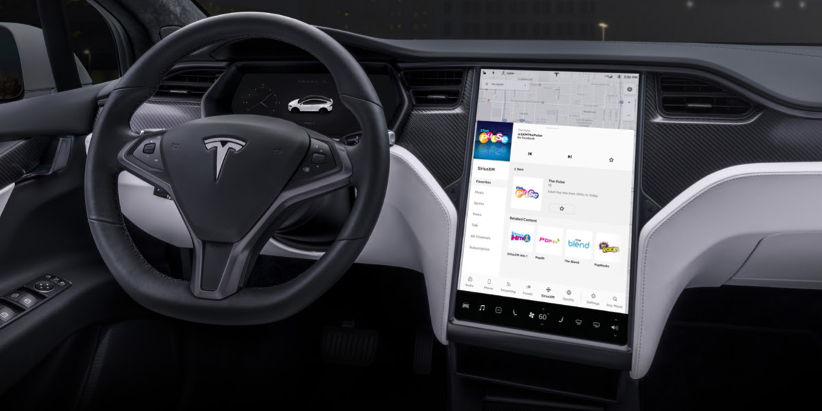
Tesla has rolled out a free three-month trial subscription to Sirius XM, in what appears to be the company’s latest push into making its vehicles’ entertainment systems more feature-rich. The new Sirius XM offer will likely be appreciated by owners of the company’s vehicles, especially considering that the service is among the most popular satellite radios in the country today.
Tesla announced its new offer in an email sent on Monday. An image that accompanied the communication also teased Tesla’s updated and optimized Sirius XM UI for its vehicles. Following is the email’s text.
“Beginning now, enjoy a free, All Access three-month trial subscription to Sirius XM, plus a completely new look and improved functionality. Our latest over-the-air software update includes significant improvements to overall Sirius XM navigation, organization, and search features, including access to more than 150 satellite channels.
“To access simply tap the Sirius XM app from the ‘Music’ section of your in-car center touchscreen—or enjoy your subscription online, on your phone, or at home on connected devices. If you can’t hear SiriusXM channels in your car, select the Sirius XM ‘Subscription’ tab for instruction on how to refresh your audio.”
Tesla has actually been working on Sirius XM improvements for some time now. Back in June, for example, Tesla rolled out its 2020.24.6.4 update, and it included some optimizations to its Model S and Model X’s Sirius XM interface. As noted by noted Tesla owner and hacker @greentheonly, the source code of this update revealed that the Sirius XM optimizations were also intended to be released to other areas such as Canada.
Interestingly enough, Sirius XM is a popular feature that has been exclusive to the Model S and X. Tesla’s most popular vehicle to date, the Model 3, is yet to receive the feature. One could only hope that Sirius XM integration to the Model 3 may eventually be included in the future. Such an update would most definitely be appreciated by the EV community, especially since some Model 3 owners have resorted to using their smartphones or third-party solutions to gain access to the satellite radio service.
The fact that Tesla seems to be pushing Sirius XM rather assertively to its customers seems to suggest that the company may be poised to roll out more entertainment-based apps in the coming months. Apps such as Sirius XM, Spotify, Netflix, and YouTube, may seem quite minor when compared to key functions like Autopilot, after all, but they do help round out the ownership experience of Tesla owners. In a way, Sirius XM does make sense for Tesla’s next-generation of vehicles, especially the Cybertruck and the Semi, both of which would likely be driven in areas that lack LTE connectivity.

