When Tesla first revealed that Model 3 would drop the instrument cluster typically found behind the vehicle’s steering wheel, speculation abounded by why that was the case quickly evolved into community discussions on why or why not Model 3 would have a heads up display, or HUD as they’re commonly referred to as.
Taking the traditional cluster out of the car would make a lot of sense if Model 3 will be fully autonomous, but based on the company’s cautious pacing with the roll out of Autopilot 2.0 (AP2) on vehicle’s equipped with “hardware 2”, it’s likely that fully autonomous AP2 development will stretch out over a period of years after Model 3 officially launches, barring regulatory approval.
With sights set on a the build out of a fully autonomous ride sharing network, Tesla’s implementation of a HUD would improve upon overall rider’s experience – there would be more room as a result of not having bulky hardware in front of the “driver” – while ensuring that displays for manual driving mode was still available. A HUD buries all the hardware in the dash so when the car is ready for full autonomy, the HUD effectively disappears, instantaneously restoring the minimalist look of the dash.
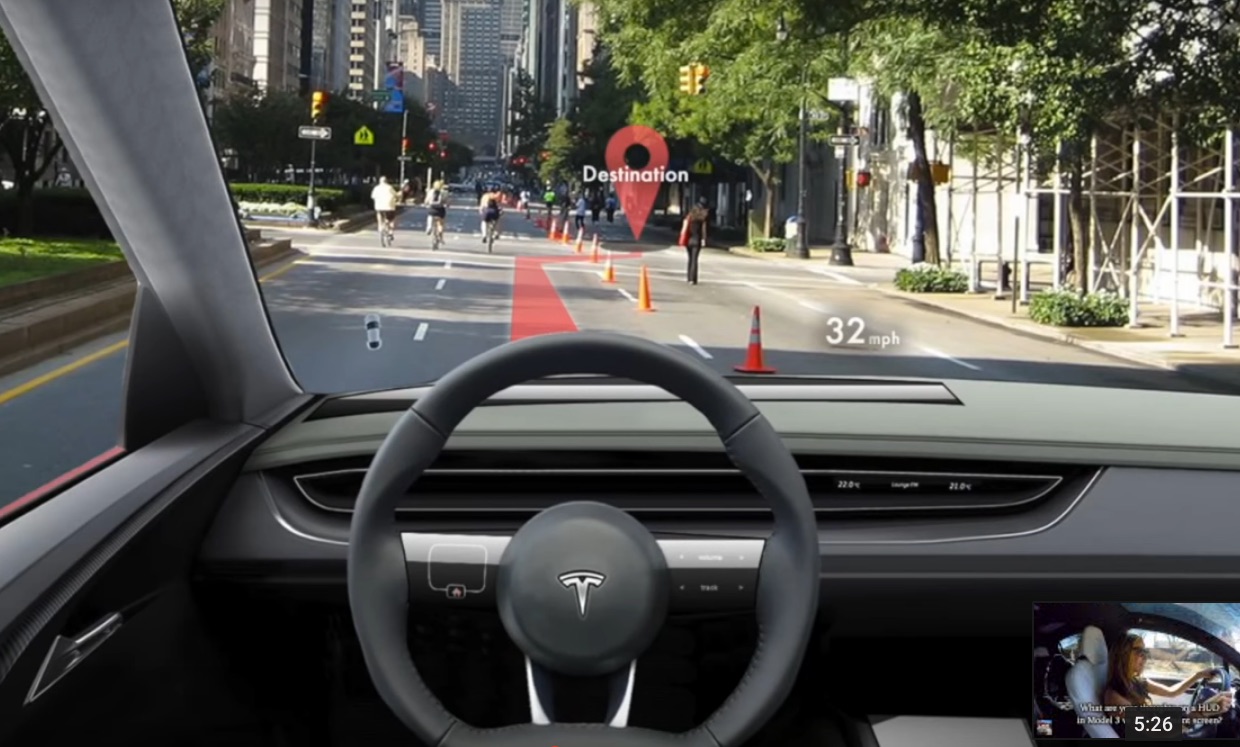
Popular Tesla-focused YouTube channel Like Tesla discusses what a Model 3 HUD might look like by deconstructing an extremely well thought out conceptual look by Steve Ono.
Steve took the concept of a HUD which in essence projects typical driving data such as speed, direction of travel, navigation instructions and sound system volume levels onto the windshield. The technique of augmented reality allows the driver to interact with the car and receive data from the car without having to look down.
This has a massive impact on the user interface and user experience in the car, as the driver can keep their full attention on the road while having full peripheral vision and forward sight. Additionally, the concept adds value above and beyond just speed, navigation and other car functions by adding active visual safety cues to the HUD.
Blind spot detection, lane change warnings and other warnings that reside down in the gauge cluster on the Model S and X are projected up and onto the windshield as a non-intrusive warning that could expand or move to the center depending on the severity of the warning.
While these concepts are just that – concepts – at this point, they make a lot of sense, are completely practical today and play on key themes that define Tesla: safety, technology and innovation. Will we see a Model 3 HUD in the design studio come June? We sure hope so.
Let us know what you think in the comments.

